Your buyers are human beings with emotions, experience, and reactions. While designing your store, there are few things to keep in mind. The first thing that matters the most is thinking from the buyer’s perspective. If you want to understand how a buyer will react to your store or product, first step into the shoes of your buyers. What will you look for while buying the product and why? You will definitely find an answer to these obvious questions. Design psychology takes the same in consideration, implying human emotions to convert a lead on your store to a buyer. Design psychology mainly deals with the experience a user has on your site or store and design techniques that can help improve the same. As your users or leads are in a virtual store without any physical contact, design can play a very important role to your buyers. Ensuring the best user experience on your web page or online store is the best way you can trigger a sale. In other words, you have to induce emotions in the users or browsers who are more likely to bounce off unless you grab their attention and inflict an emotion.
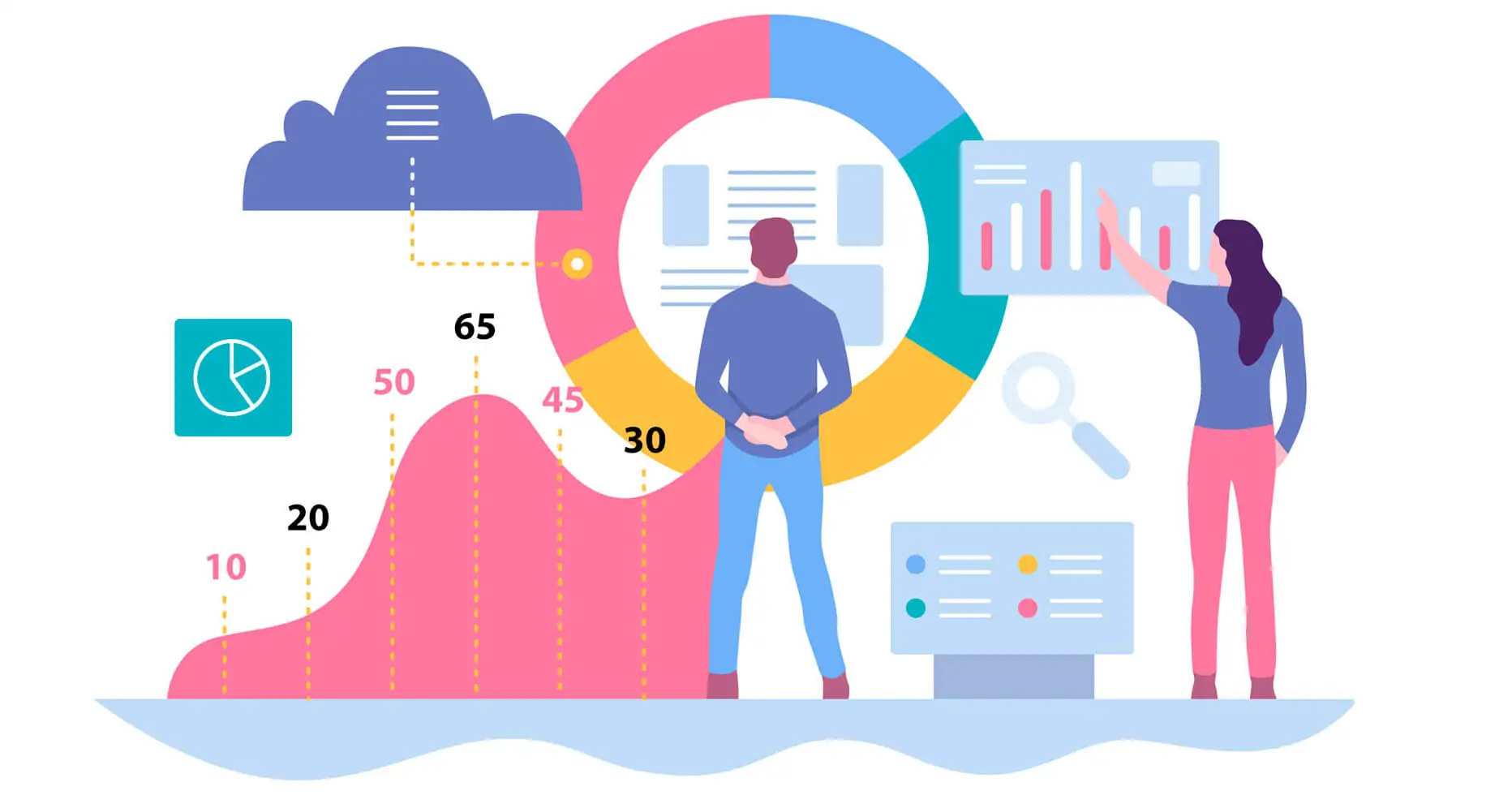
How to Implement Design Psychology Implementing design psychology can be a very efficient method of converting your leads to buyers and user of your products.
Keep it Simple Keeping things simply the ideal method that can really improve user experience on a website or web store. Over complicated design and trickery can be very dangerous from the user point of view. People can bounce off your site and resent your site in case you try to force the users with the new experience they are not used to. We all are familiar with the product browsing page or the buy now button, or the payments page. It is more or less similar on every web store be it big brands like Amazon or simple Shopify stores.
Do not Alter User Experience from Past Introducing a new design or the new process of checkout or browsing a product can confuse the users on your site and they can bounce off. To keep thing tidy, it is always advisable to follow the practice that we are used to seeing. However, it does not mean we should never update or tweak our stores. Tweaking and updating are based on the experiences we are used to and not completely different or new. Using different fonts or colors can make your store stand out but implementing complex design is not good for user experience.
Highlighting Important Information On an online store user generally, tend to know what they are looking for and want to buy. To make things easier for the customers to place an order is the main point of consideration for any store designer. Smoother the experience of navigating on an online web store, buyers are more likely to place an order. It is always advisable for designers to take into consideration the highlighting factors that they want the buyers to notice. Rather than cluttering the users with tons of information, highlight the important points. It will always act in the favor for the buyers to know in a brief attention of the benefits and uses. Which can increase the chances of leads to convert into buyers without much persuasion. You should never be too persuasive or the buyers can bounce off. Try putting out the important or highlighting points to the buyers and make it easier for users to navigate the store. These small but very influential factors can truly change the user experience on your store and increase the rate of conversion.