In today’s digital-first world, your website is often the first interaction potential customers have with your brand. With the massive variety of devices used to access the internet—from smartphones and tablets to laptops and desktops—it’s no longer a luxury to have a mobile-friendly website. It’s a necessity. That’s where responsive web design comes in.
But what exactly is responsive web design, and why is it so important in 2025? In this blog, we’ll break down the concept, explore its benefits, and explain why your business can’t afford to ignore it.
What Is Responsive Web Design?
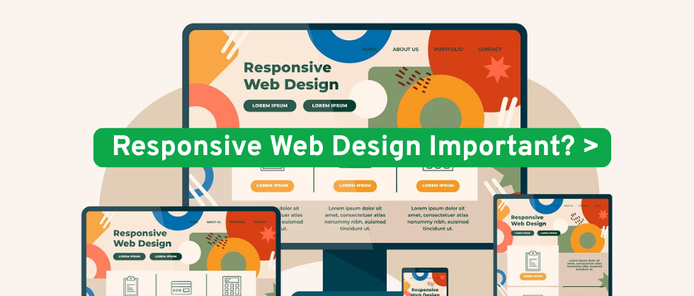
Responsive web design (RWD) is an approach to web development that ensures a website looks and functions well on all devices, regardless of screen size. This means your site will automatically adjust its layout, images, and functionalities to provide a seamless user experience across desktops, tablets, and smartphones.
In practical terms, responsive websites use flexible grids, media queries, and fluid images to adapt the design. The goal is to create one site that delivers a consistent experience for every user, whether they’re browsing from a 6-inch phone or a 27-inch monitor.
Why Is Responsive Web Design Important?
1. Improved User Experience (UX)
One of the most compelling reasons for adopting responsive web design is user experience. Websites that are hard to navigate on mobile devices drive users away. In contrast, a responsive design ensures that content is easy to read, menus are easy to access, and the overall experience is intuitive, no matter the device.
According to Google, over 60% of users are less likely to return to a website if they have trouble accessing it on mobile. A frustrating mobile experience not only results in lost traffic but can seriously harm your brand reputation.
2. Mobile Usage Continues to Rise
As of 2025, over 55% of global web traffic comes from mobile devices. This trend is only expected to grow as mobile technology continues to improve and data becomes more affordable and accessible.
Key SEO keywords: mobile-friendly websites, mobile-first design
If your site isn’t optimized for smartphones and tablets, you’re missing out on a massive audience. With a mobile-friendly website, you’re not just improving accessibility—you’re tapping into a dominant share of web users.
3. Better SEO Performance
Search engines like Google prioritize responsive websites in their rankings. Since 2018, Google has used mobile-first indexing, meaning it primarily uses the mobile version of a site to determine its search ranking.
Key SEO keywords: SEO benefits, mobile-first indexing, responsive web design for SEO
This means that if your website isn’t mobile-friendly, your search engine rankings may suffer, and your organic traffic could decline. A responsive design improves dwell time, reduces bounce rates, and increases the likelihood of ranking for relevant keywords.
4. Faster Website Loading Speeds
Page speed is a critical ranking factor for SEO and a crucial component of user experience. Responsive websites often perform better in terms of loading speed, especially on mobile devices. They eliminate the need for redirects to a mobile-specific version of the site, which reduces load time.
Key SEO keywords: website performance, fast-loading websites, responsive design speed benefits
A fast, responsive website keeps users engaged and encourages them to explore more pages—something search engines love.
5. Lower Maintenance Costs
Before responsive design became mainstream, many businesses created separate desktop and mobile versions of their websites. Maintaining two sites is costly, time-consuming, and inefficient.
With responsive web design, you only need to manage one site, which means lower maintenance costs and faster updates. You also ensure consistent branding and messaging across all devices.
Key SEO keywords: website maintenance, cost-effective web design
6. Higher Conversion Rates
A site that functions flawlessly on any device improves trust and makes it easier for users to complete actions—whether that’s making a purchase, filling out a form, or signing up for a newsletter.
Key SEO keywords: responsive website conversion, mobile-friendly conversion rates
Responsive websites remove barriers to conversion by providing a smooth experience from start to finish. With more users browsing and buying on mobile, this translates directly to increased revenue and lead generation.
7. Improved Analytics and Reporting
Tracking and analyzing user behavior is much easier with a single, responsive website. Tools like Google Analytics automatically adapt to track data across devices, giving you clearer insights into user journeys and allowing you to make smarter business decisions.
Key SEO keywords: responsive web analytics, mobile user behavior, unified tracking
How to Implement Responsive Web Design
If your current website isn’t responsive, you have a few options:
-
Redesign Your Site: Start from scratch with a responsive framework like Bootstrap or Tailwind CSS.
-
Use a Responsive CMS Theme: Platforms like WordPress and Shopify offer pre-built responsive themes.
-
Hire a Web Design Expert: A professional web developer can tailor a responsive solution for your business needs.
Future-Proofing Your Website
The digital landscape is evolving rapidly. From smart TVs to wearable tech, users will continue to access the internet through a growing variety of devices. A responsive web design ensures your site is ready for whatever the future holds.
Key SEO keywords: future-proof website design, responsive trends 2025
Moreover, Google is constantly updating its algorithms to favor user-centric websites. Responsiveness is no longer just a technical feature—it’s a key business asset.
Responsive web design is more than a trend—it’s the standard. Whether you’re a small business, a blogger, or a large enterprise, having a mobile-friendly, responsive website is essential for success in 2025 and beyond.
It improves user experience, enhances your SEO performance, increases conversion rates, and lowers maintenance costs—all while helping your brand stand out in a crowded digital market.
If your site isn’t responsive yet, now is the time to make the change.