As user preferences continue to evolve, dark mode is no longer just a trendy feature—it’s becoming a necessity for many websites and apps. In 2024, dark mode is fast becoming the default option on many platforms, as designers and developers increasingly recognize the importance of catering to user needs and improving overall digital experiences. But why is dark mode so popular, and how does it fit into the larger picture of user-centric design? Let’s explore.
What Is Dark Mode?
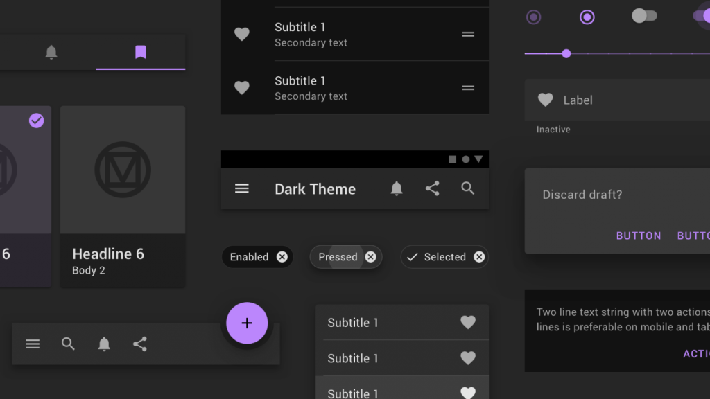
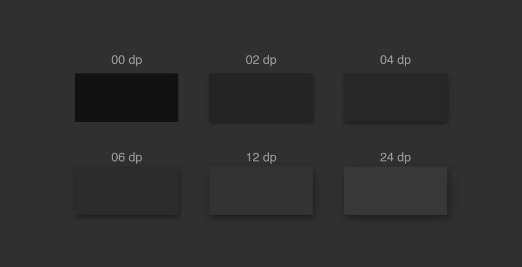
Dark mode is a visual design choice where the background of a website, app, or interface is set to a dark or black color, while text and key elements are displayed in light, usually white or light grey. This contrasts with the traditional light mode, where the background is light and text is dark.
While dark mode is nothing new, it has quickly become a mainstream design choice in 2024. With major tech giants like Apple, Google, and Twitter offering dark mode on their operating systems and apps, the trend has become ingrained in everyday digital interaction.
Why Dark Mode? The Benefits of User Comfort

1. Reduced Eye Strain
One of the primary reasons users gravitate toward dark mode is that it’s easier on the eyes, especially in low-light environments. When using devices in the dark, the stark contrast of a light background with dark text can cause discomfort and strain. Dark mode provides a gentler alternative, reducing the brightness of the screen and offering a more relaxed viewing experience.
- User-centric impact: Less eye strain means longer and more comfortable browsing, which is particularly important for people who use their devices for extended periods.
2. Improved Battery Life
For devices with OLED or AMOLED screens, dark mode can also help improve battery life. These displays work by lighting up individual pixels, so dark backgrounds (which require fewer pixels to be lit) result in lower power consumption. This makes dark mode not only a visual preference but also a practical feature for mobile users.
- User-centric impact: Users benefit from longer battery life, particularly on mobile devices, reducing the need for frequent recharges.
3. Aesthetics and Focus
Beyond functionality, many users simply prefer the aesthetics of dark mode. The sleek, modern look of dark backgrounds combined with bright accents creates a visually appealing contrast. Additionally, dark mode helps focus attention on the content rather than the interface itself, creating a cleaner, more immersive experience.
- User-centric impact: A more streamlined and immersive experience that puts the content front and center, without distractions.
Dark Mode as the Default Setting
While offering dark mode as an option has become a common feature, making it the default setting is what truly sets a website or app apart. For users, this means they no longer need to manually toggle settings to change the interface. Instead, they are automatically presented with a comfortable, visually ergonomic design upon launch.
The shift to dark mode as the default reflects a broader trend in user-centric design, where personalization and ease of use are at the forefront. Rather than forcing users to make adjustments, the design anticipates their preferences and adapts automatically.
The Power of User-Centric Design
User-centric design is all about putting the user’s needs and preferences first—and dark mode is a prime example of this approach. The idea is simple: users should feel in control of their digital experience, and their comfort should be prioritized.
By offering dark mode as the default, websites and apps are acknowledging that their users value personalization and ease of access. With research indicating that a large portion of users prefer dark mode—especially on mobile devices—designers are recognizing the importance of making this choice more accessible and intuitive.
How Dark Mode Fits Into User-Centric Design

1. Seamless Transitions Between Modes
While dark mode may be the default, offering an option to switch back to light mode at any time can make the experience even more flexible. Many websites and apps now allow users to toggle between the two modes with a simple click or swipe, giving them the freedom to choose the mode that best suits their environment and task. Some even use automatic switching based on the time of day or lighting conditions, further enhancing the user experience.
- Example: Websites like YouTube and Google Chrome offer seamless transitions between modes, allowing users to choose based on their immediate preference or the time of day.
2. Consistency Across Platforms
One of the key advantages of dark mode is that it provides visual consistency across different devices and platforms. Whether a user is browsing on their desktop, tablet, or phone, dark mode ensures that the experience is unified, reducing the need for constant adjustments. As users move between devices, they want a consistent look and feel, and dark mode offers just that.
3. Improved Accessibility
Dark mode doesn’t just benefit general users; it also plays a critical role in making websites more accessible. For individuals with visual impairments, such as light sensitivity or migraines, dark mode can help reduce discomfort and fatigue. Offering dark mode as the default shows that the design is inclusive and considers a wide range of user needs.
Implementing Dark Mode: Best Practices

If you’re considering implementing dark mode on your website or app, here are some best practices to keep in mind:
- Ensure Contrast and Legibility Make sure the contrast between the text and background is strong enough to be readable. A poorly designed dark mode with low contrast can lead to eye strain and frustration for users.
- Avoid Overly Bright Colors While dark mode typically uses light text on a dark background, overly bright or neon-colored text can be jarring. Opt for softer hues for highlights and buttons to maintain a comfortable visual experience.
- Provide User Control While dark mode may be set as the default, it’s important to allow users to switch back to light mode if they prefer it. Give them an easy toggle option, and consider offering an automatic setting that adjusts based on time of day or ambient light.
- Test for Performance and Accessibility Ensure your design is not only visually appealing but also accessible to all users, including those with disabilities. Test for readability, navigability, and overall performance on both desktop and mobile devices.
In the digital age, user-centric design is more than just a trend—it’s a necessity. With dark mode emerging as the default setting across many websites and apps, designers are prioritizing user comfort, accessibility, and visual appeal in ways that cater to both practical and aesthetic needs. By offering a seamless, customized experience from the get-go, dark mode reflects a broader movement toward a more thoughtful, personalized digital world.
As dark mode continues to evolve and become the norm, expect to see even more innovations in design that make the user experience more intuitive, inclusive, and tailored to individual preferences. For users, it’s a win—but for designers and businesses, it’s an opportunity to connect with their audience in a deeper, more meaningful way.


