CASE STUDY

Chili’s

Created a high-impact, visually engaging website that promoted menu items, drinks, and offers while driving in-store traffic and brand engagement.

Chili’s project preview

PROJECT OVERVIEW

Designing a High-Impact Digital Experience for a Fast-Paced Restaurant Brand

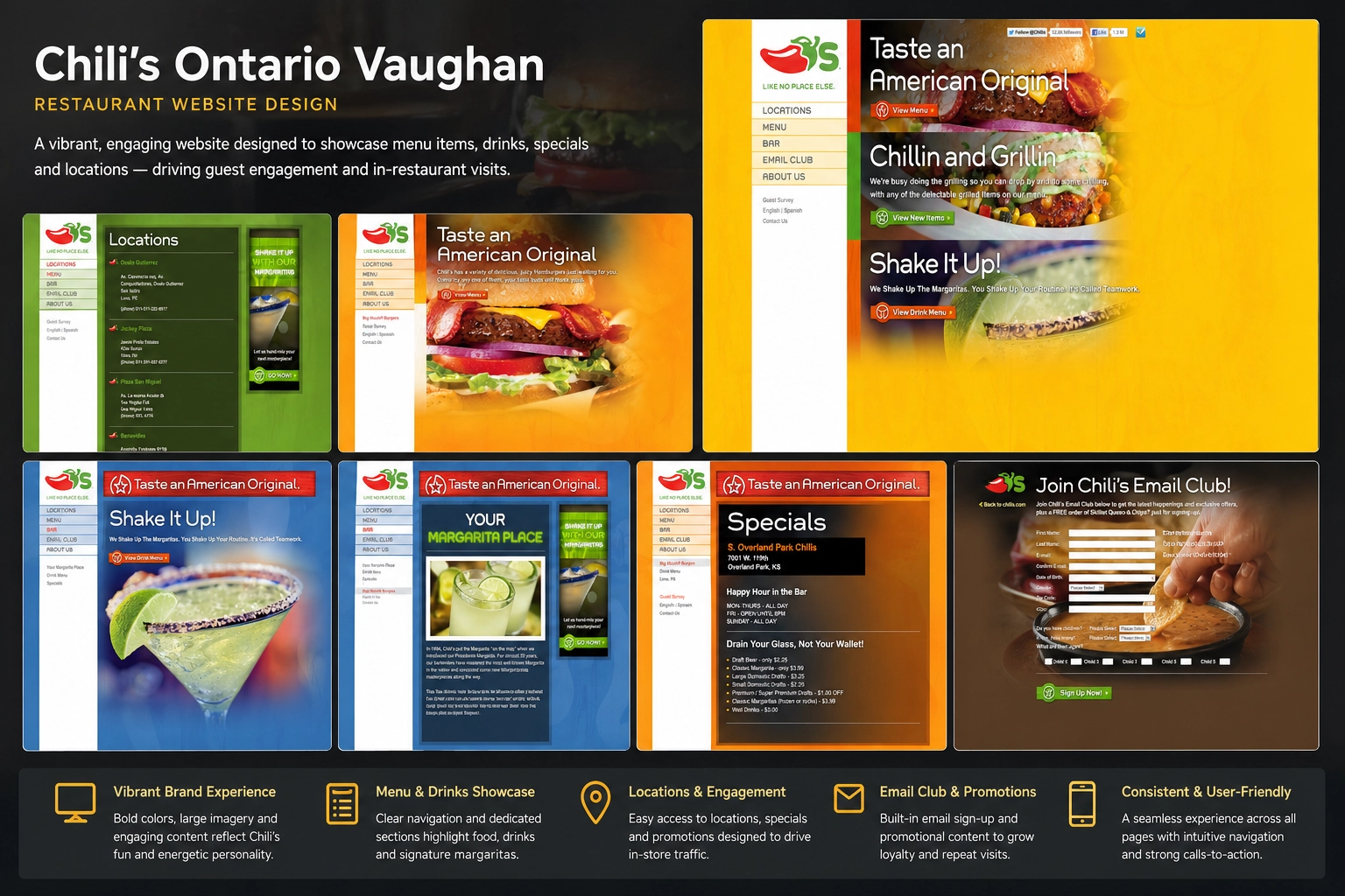
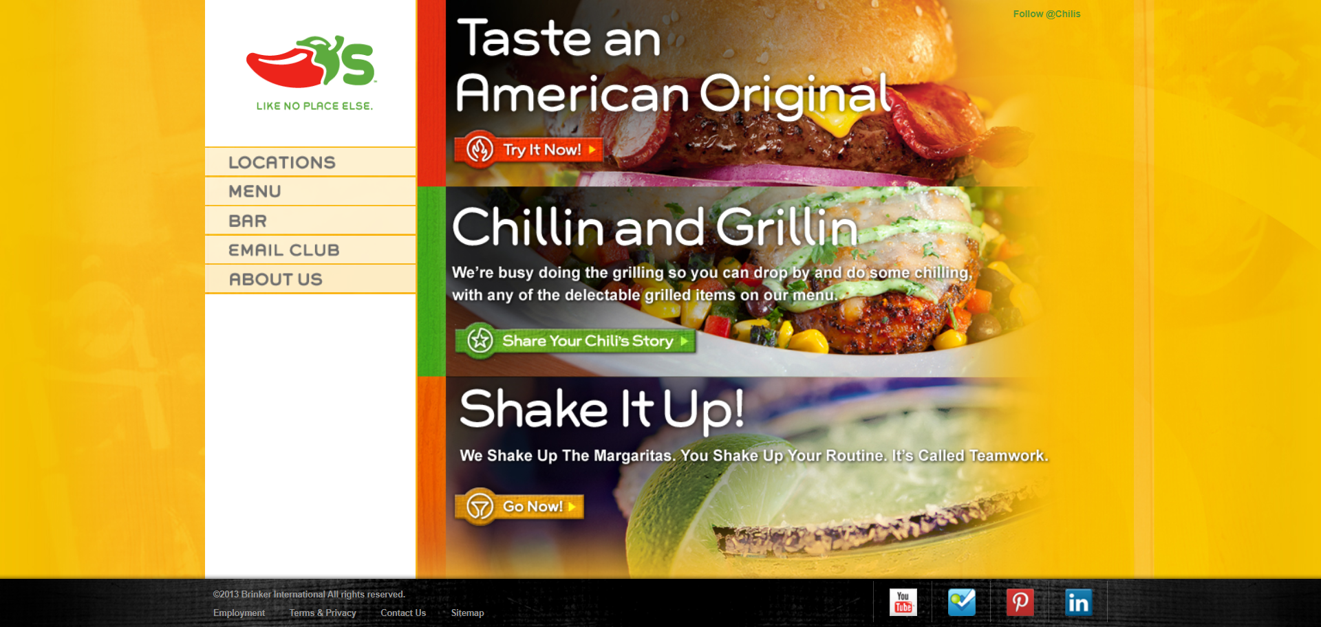
The Chili’s Vaughan location required a website that matched the brand’s energetic identity while effectively promoting menu items, drinks, and ongoing specials. The focus was on creating a visually immersive experience that encouraged users to explore offerings and visit the restaurant. The design leveraged bold colors, large food imagery, and promotional callouts to replicate the in-store experience digitally. As seen across the design system, sections like “Taste an American Original” and “Shake It Up” were used to highlight core offerings and drive engagement.

CHALLENGE

What Needed to Improve

  • Needed to reflect a high-energy brand experience digitally
  • Heavy content (menus, drinks, specials) required structured presentation
  • Users needed quick access to menus and promotions
  • Balancing visual impact with usability
  • Driving in-store visits rather than online transactions

STRATEGY

How We Approached the Project

  • Designed around visual-first engagement (food, drinks, atmosphere)
  • Structured navigation for quick access: Menu, Bar, Locations, Specials
  • Built strong promotional sections to highlight key offers
  • Used color psychology (reds, yellows, greens) to stimulate appetite and action
  • Prioritized CTA-driven browsing (View Menu, View Drinks, Promotions)

EXECUTION

What We Delivered

  • Developed a bold homepage with layered promotional banners and imagery
  • Created dedicated sections for food, drinks, and specials
  • Designed menu pages with grid-based item layouts and pricing visibility
  • Implemented high-impact visuals (burgers, margaritas, featured items)
  • Built an email capture system for promotions and loyalty engagement
  • Structured pages like “Locations” and “Bar” for quick navigation and discovery
  • Used consistent branding elements across all pages for recognition and continuity

WORK BREAKDOWN

Website Strategy & Structure

Chili’s website strategy preview
Preview showing the visual direction, content hierarchy, and conversion-focused structure.

OUTCOME

Results

  • Strong visual alignment with brand identity
  • Improved user engagement through image-driven navigation
  • Clear pathways to menus and promotions
  • Enhanced in-store traffic potential through promotional focus
  • Scalable structure for multi-location or franchise expansion

Ready to Become the Next Case Study?

Let’s build a website that improves trust, supports search visibility, and turns more visitors into leads.

Custom-built websitesSEO-ready structureBuilt for conversions